Project Review
Pricelio
Client: Pricelio
Industry: PropTech SaaS
Scope: Branding, Logo Design, UI Design, Website
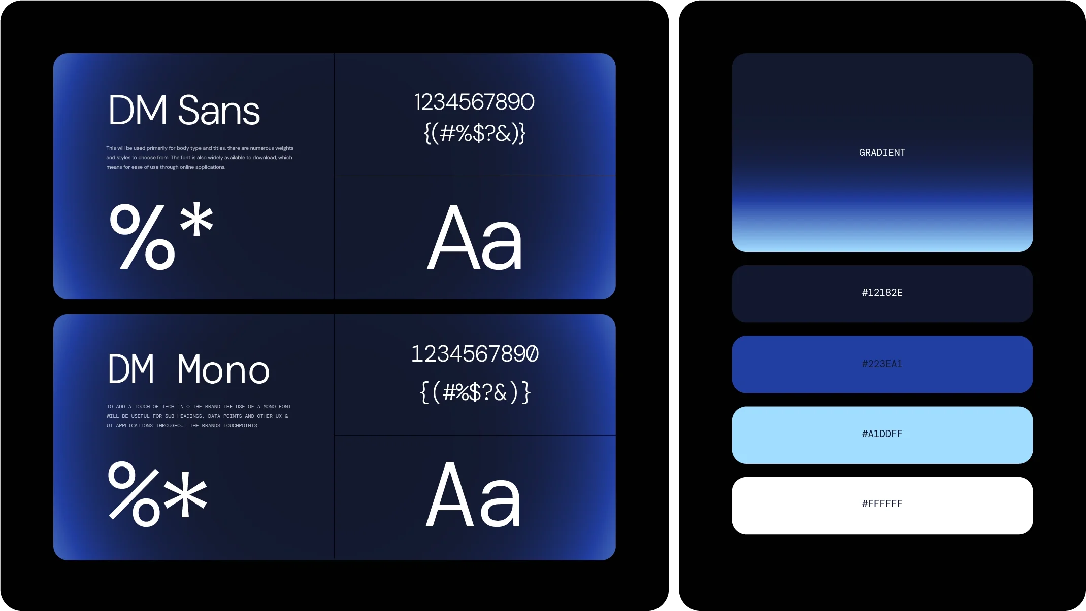
Deliverables: Logo, Ident / Favicon, Colour Palette, Typography, Dashboard UI, Website UI, Social Media Templates
Timeline: 3 Days
OVERVIEW:
Blair Property Group, a longstanding client of ADY Studio, approached me to help launch its new AI-powered PropTech venture, Pricelio.
Pricelio is an interactive price-list platform built specifically for off-the-plan property sales. It replaces traditional PDFs and spreadsheets with a live, branded digital experience where agents and buyers can instantly access current pricing, availability, floorplans and project information.
The project was delivered from initial brand concept through to a complete digital design system in just three days, giving the development team a clear visual foundation to take the product to market.

The Challenge
Standing Out.
In Style.
PropTech and AI SaaS are increasingly crowded spaces, so the challenge was to create an identity that immediately felt credible as a technology product without disappearing into the sea of generic SaaS branding.
The brand needed to feel intelligent, intuitive and distinctly digital while remaining approachable enough for property developers, sales agents and buyers. It also needed to work seamlessly across everything from a tiny favicon to a full dashboard interface and marketing website.
The Approach
Building a Brand That Reflects Strength and Style.
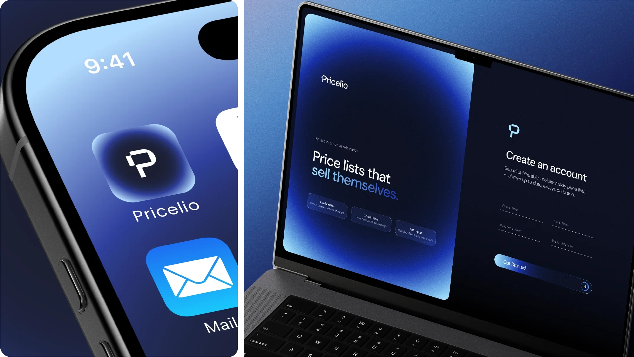
I developed a clean custom wordmark alongside a distinctive P ident, designed to become the recognisable shorthand for Pricelio across favicons, app icons, social media and the wider product ecosystem.
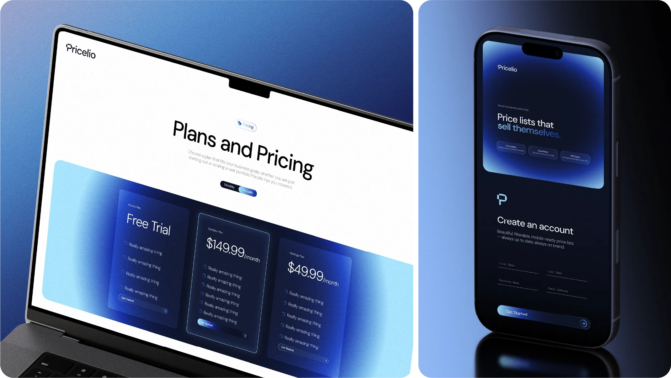
With blue established as the preferred direction, I built a contemporary colour palette around a circular gradient that became a recurring visual device throughout the identity. This informed the treatment of icons, buttons, interface elements and supporting graphics, creating consistency between the brand and the product itself.
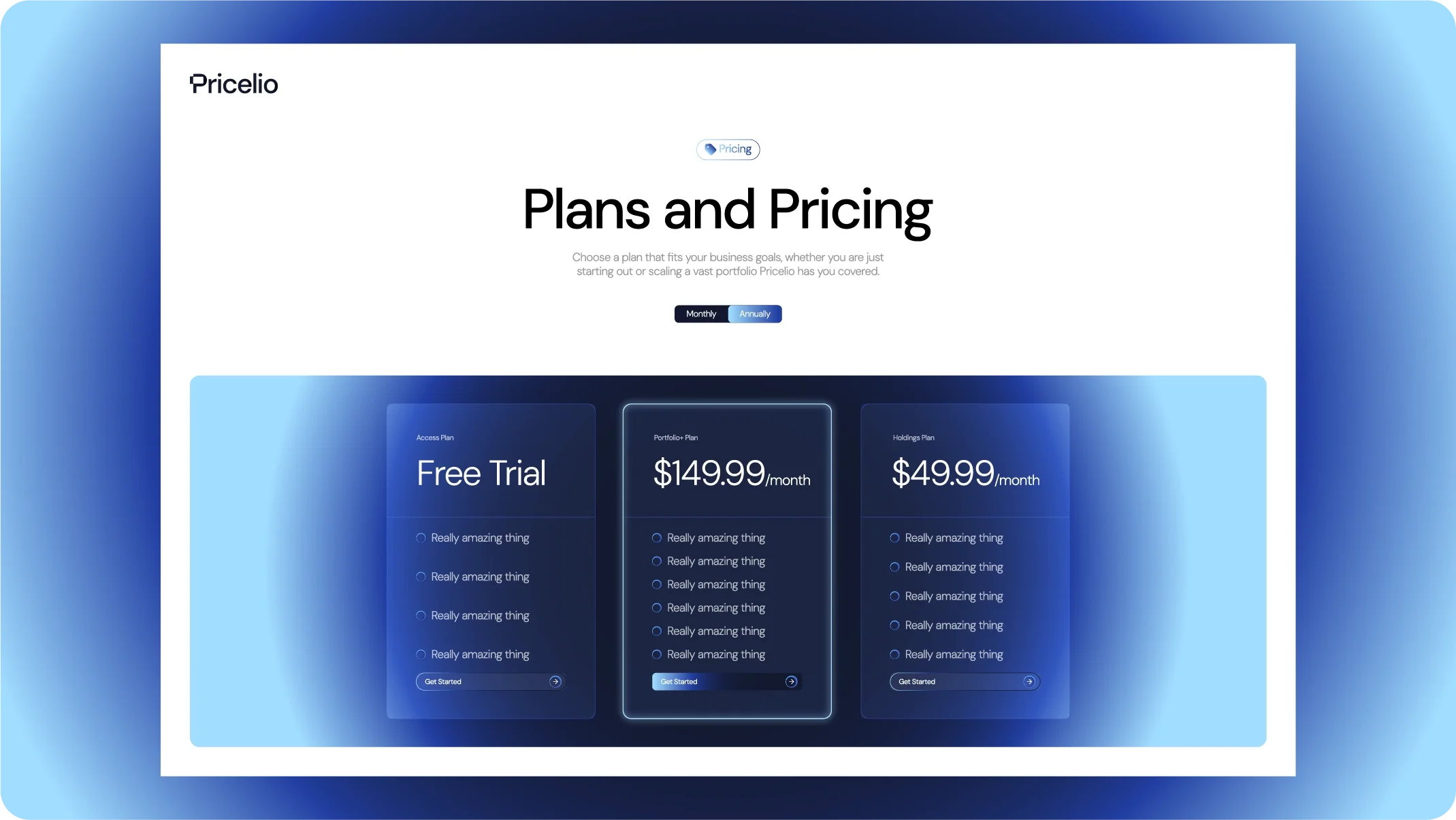
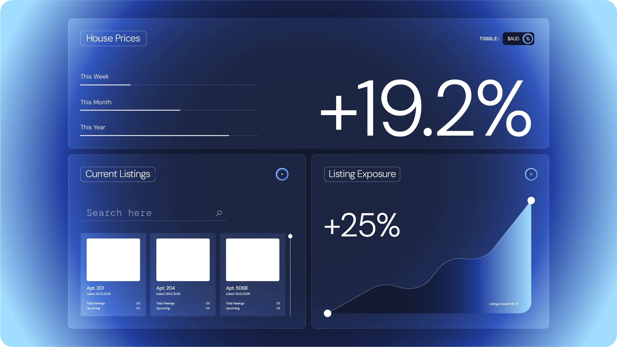
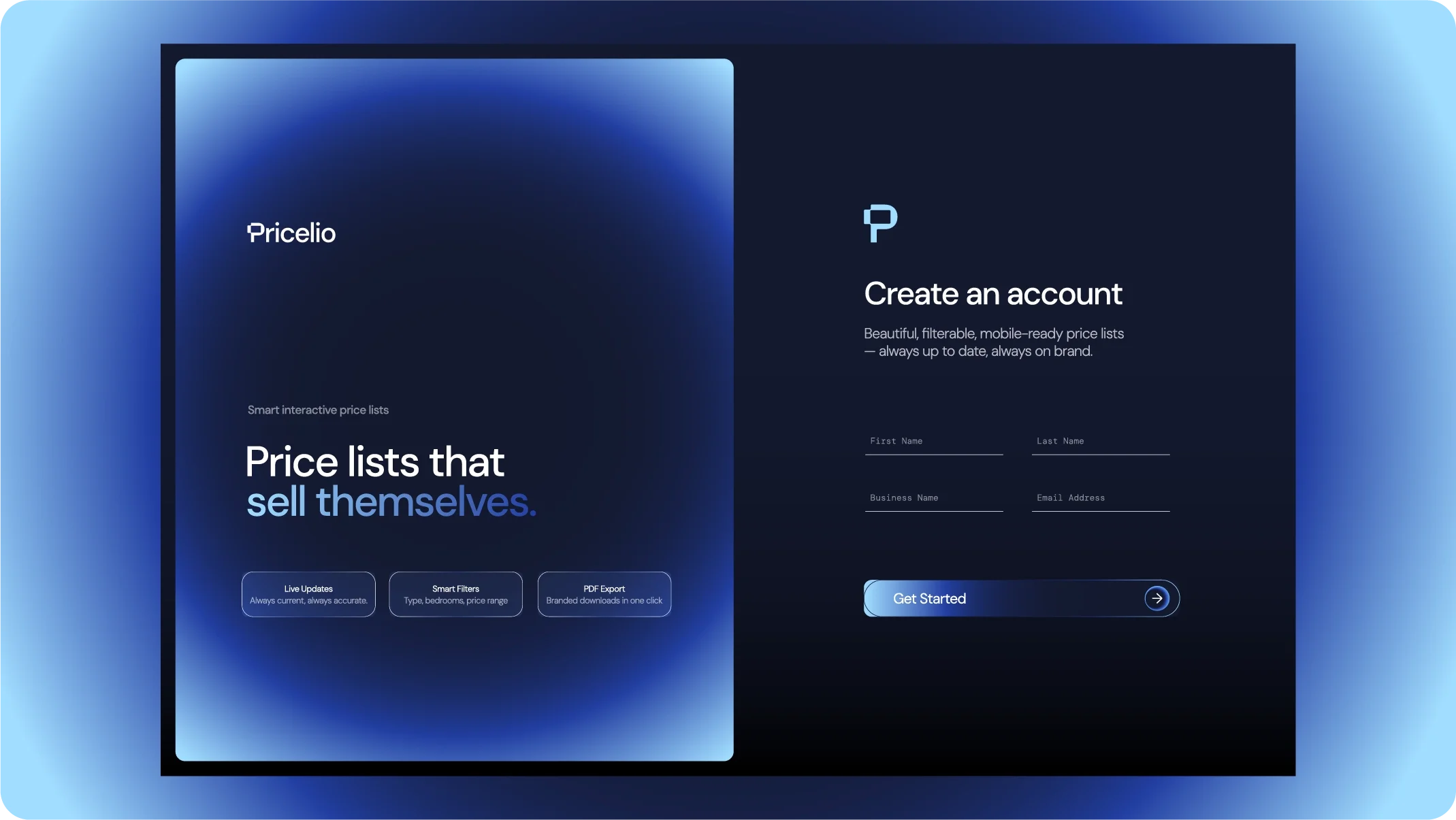
The UI extended this system using translucent surfaces, soft gradients and a liquid-glass aesthetic inspired by contemporary device interfaces. Rather than treating the brand, website and software as separate pieces, everything was designed as one connected digital experience.
The Outcome
A Brand Ready For Launch.
Within three days, Pricelio had a complete visual identity and digital design direction ready for development.
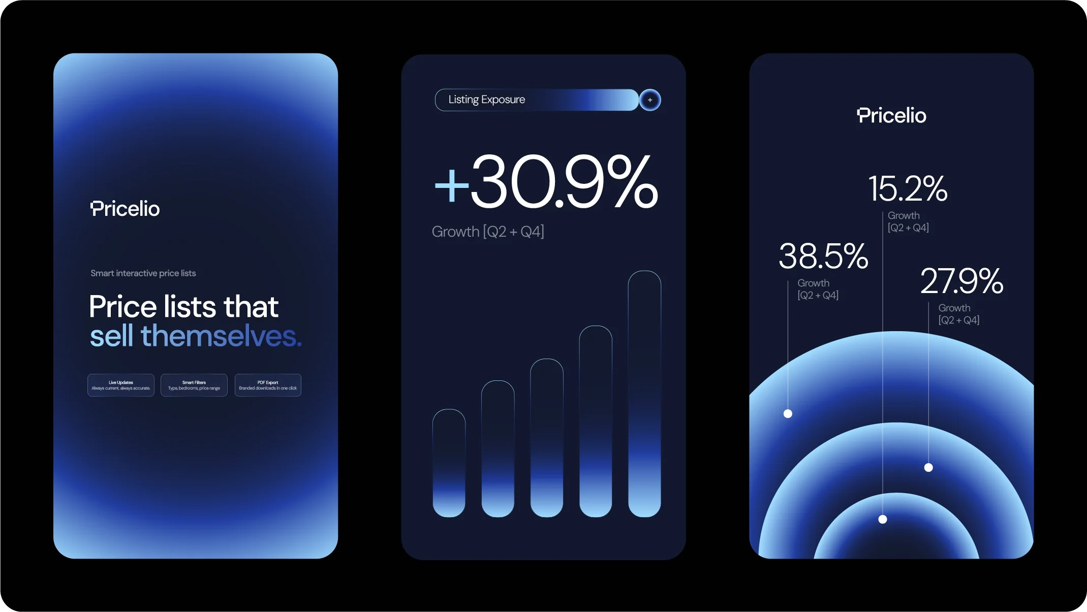
The final system included the logo and ident, colour and typography system, dashboard UI, website UI and supporting social assets. Together, these gave Pricelio a distinctive visual language that could be handed directly to its developers and consistently translated across the live product.
The result is a brand that feels unmistakably SaaS, while retaining enough personality and visual distinction to stand apart within the rapidly growing PropTech landscape.
Industry Insight
From Static to Interactive.
Property sales still rely heavily on static PDFs, spreadsheets and manually updated price lists — formats that quickly become outdated as pricing and availability change.
Pricelio transforms that traditionally static part of the sales journey into a live digital touchpoint. For developers and agents, that means information can remain current and centrally managed. For buyers, it creates a clearer and more intuitive way to explore available properties.
The brand therefore needed to communicate more than technology. It needed to represent the shift from static property information to a live, interactive sales experience.